
Introduction
Expanding Jio’s design foundations to spatial mixed reality experiences to democratize XR in India.
JioTesseract is on a mission to democratize XR in India, empowering everyone to create and engage with immersive experiences. We’re building a diverse range of devices, from entry-level mobile phone-based cardboard solutions to high-end standalone mixed reality devices. Our commitment extends beyond hardware; we also develop developer tools, an operating system, and a suite of first-party applications, including JioCinema, JioSaavn, JioGames, and JioPhotos.
Leading the platform design team for our high-end devices, I focused on crafting experiences at the system level. This involved developing SDK tools, system applications, and system UI. Central to our success was the establishment of a robust design foundation that ensures consistency and usability across all touchpoints.
🎯
JioTesseract aims to democratize XR in India by creating a diverse range of immersive devices and tools, where I led the platform design team to establish a strong design foundation for high-end mixed reality experiences.
The need for foundations
Design foundation is required to build a cohesive ecosystem of experiences.
The foundation ensured that both in-house and third-party developers create experiences that feel inherently connected, similar to how Android apps follow Material Design and iOS apps adhere to Human Interface Guidelines. The objective was to foster a design language that provides a unified aesthetic and functional identity, allowing all applications within this universe to resonate with users.
Additionally, establishing this design foundation accelerated the development of first-party apps and system applications, streamlining the process while maintaining design integrity. It also mitigated the risk of hitting design dead-ends, ensuring a more adaptable and fluid approach throughout the design lifecycle.
🎯
The foundations were aimed at creating an identity of experiences, accelerate the development, and mitigate risks of dead ends during product development lifecycle.
Foundation elements
Our medium consists of three high-level elements: The environment, the UI, and the interactions.
Foundations architecture
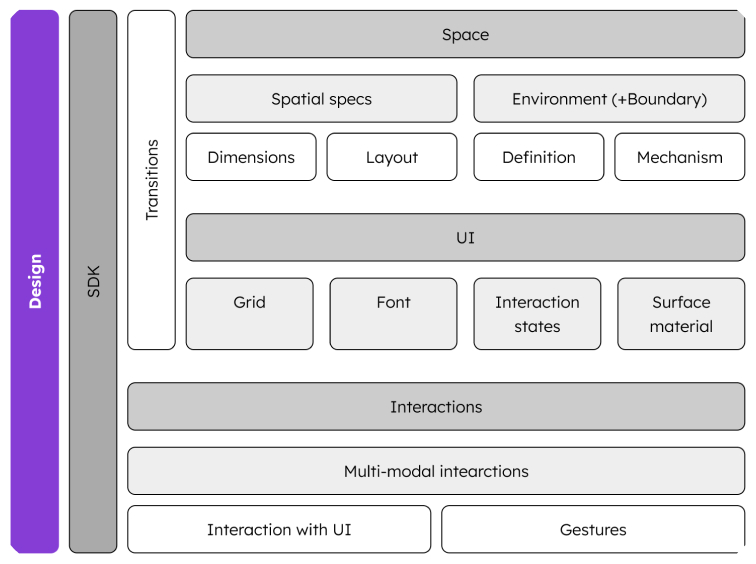
Space
The infinite area around the user beyond windows and UI is the space. This space can be an immersive virtual environment or the real environment visible through Visual See Through (VST) with digital cameras.
Spatial specifications
Environment
Definition
Mechanism
Interactive interface
The best use of the spatial medium and the caveats of the interaction technology led us to re-think crucial elements that make interfaces.
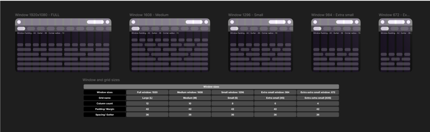
Grid system
The grid system ensures alignment between different windows. By eliminating sub-pixel issues, designers experience a smooth workflow. We achieve this by:.
Typography scales
Apart from driving consistency in hierarchy across content, typography scales on our medium had one major problem to solve: Perceived font weight due to optics and accurate interactions.
We tested different font sizes and weights at different distances and scales for legibility and perception of font-weights. On the other hand, the accuracy of eye-tracking had a huge impact on the size of interactive objects.
Surface material
While frosted glass is a typical choice of surface material in XR, we could not adopt it due to hardware limitations. After experimenting with semi-transparent materials—which posed legibility challenges—we opted for an opaque matte black board that creates a gradient-like glow from light sources. We utilize HDRI renders of the environment that contains only the information of the light, pan it 180 degrees, flip it horizontally and then create a mask of the shape of the window.
We also defined rules for usage of the material in order to create hierarchy between different areas in the interface.
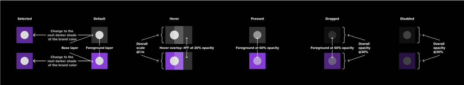
Interaction states
The chosen surface material significantly influences interaction states regarding color and contrast. We develop rules applicable to various UI elements, simplifying complexity by defining interaction states—idle, hover, pressed, dragged, and disabled—for a single UI element. This consistency fosters coherence across all interactive components.
To make best use of the space and make interactions feel spatial, hover for every interactive items elevate in the z-axis. This happens only for interactions at a distance - interacts in proximity fail when the objects that the user intends to interact with moves towards the users’ finger.
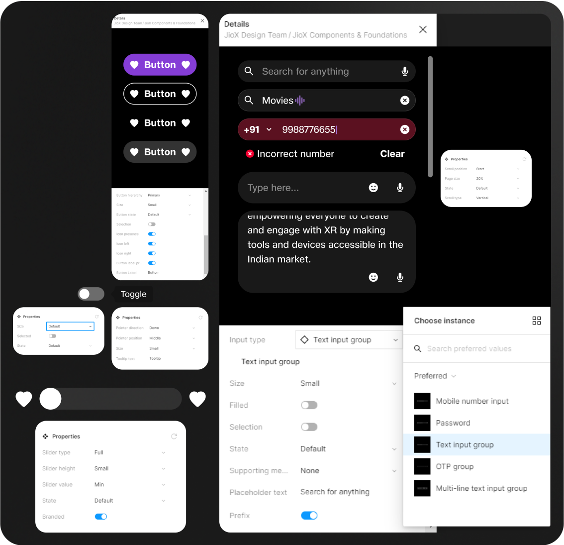
Design system
Components documented inside Figma library that can be used for rapid prototyping without compromising on the design principles.
Interactions
Interaction with each UI element must behave in the similar expected way irrespective of the way the interaction technology works.
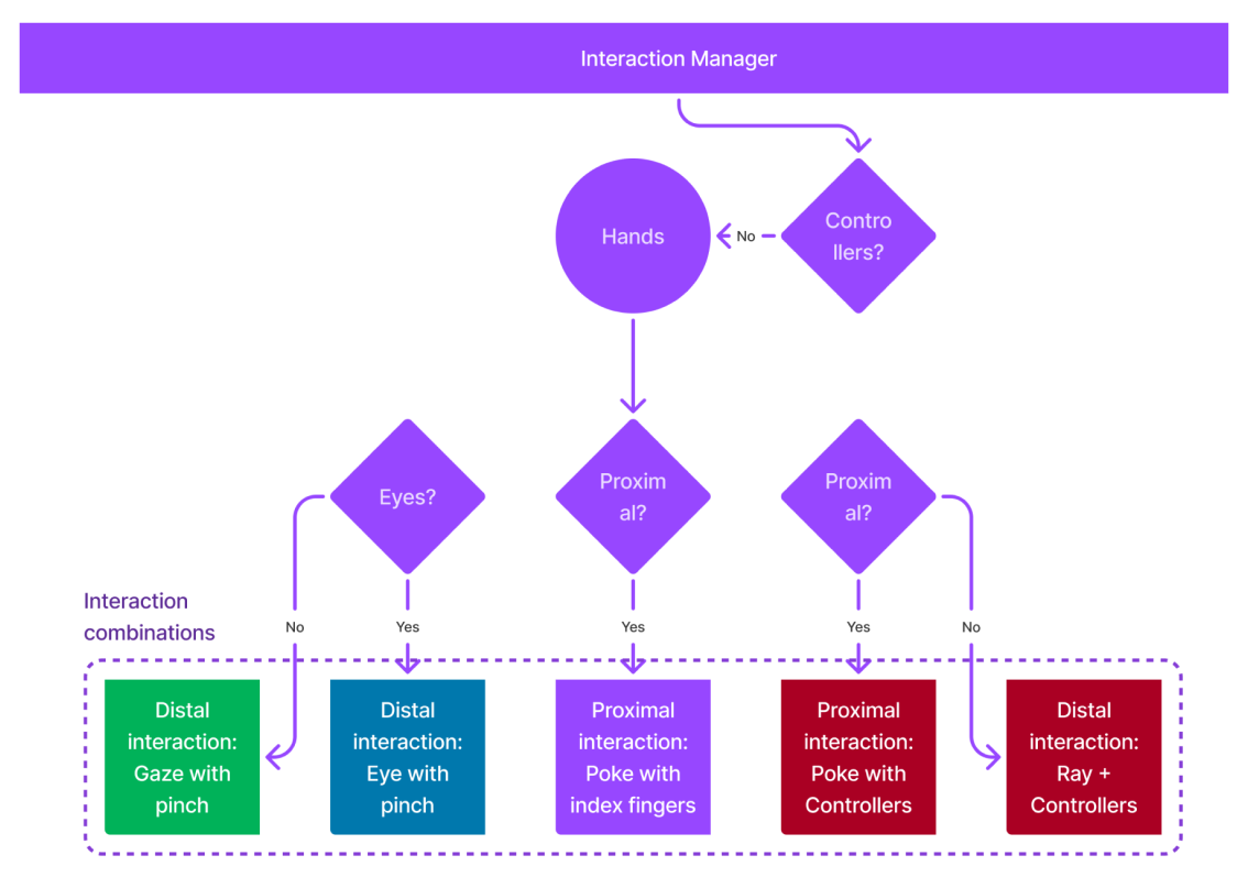
Interaction patterns for UI
Our aim is to harness natural interaction methods by supporting eye tracking, hand tracking, and controllers across three device types:
By segregating pointer interactions from selection interactions, we define intuitive usability for each interaction type across devices.
We derive interactions by changing three parameters - duration of interaction, frequency of interaction, and movement. This is depicted in the image underneath.
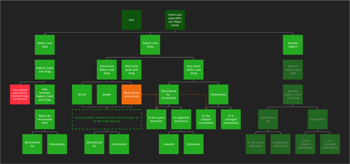
Gestures
Gestures can be performed using hands or controllers. They are derived from different interaction making them deliberate using the following two parameters.
An example of a typical gesture is to pinch in front of the device while the palm is facing inward. This results in a gesture that is deliberate and not accidental.